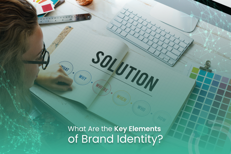
 Corporate Brand Identity: 5 Crucial Elements for Sustainable Business Growth
Table of Contents
1. The Strategic Core of Corporate Brand Identity
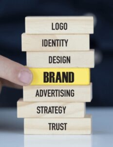
Corporate brand identity is the deliberate collection of all tangible and intangible elements that an organization creates to portray a precise, curated image to its target audience. It is the visual, verbal, and cultural language that a modern business speaks. While often conflated with general consumer branding or external brand image, your underlying system is the structural blueprint controlled entirely by your organization. It is the strategic bridge that transforms an abstract business entity into a living, breathing persona.
An enduring, authoritative presentation requires deep foundational anchoring to thrive. Before an enterprise selects a color swatch, commissions a typographic font, or drafts a logo icon, it must establish its internal strategic framework. Attempting to build a visual aesthetic without an underlying philosophy results in superficial, disjointed creative assets that fail to capture long-term consumer attention. A well-defined corporate brand identity acts as an anchor, ensuring that every external touchpoint reflects the internal realities of the firm.
The Mission and Vision Statement
The core philosophy begins with the crystallization of the brand’s purpose. The Mission Statement establishes the contemporary operational mandate of the organization. It answers the fundamental question: What do we do, for whom do we do it, and how do we execute it daily? Conversely, the Vision Statement functions as an ambitious, forward-looking North Star. Together, they establish a permanent operational boundary, keeping the brand’s presentation aligned across vertical teams to build a distinct corporate brand identity.
Core Corporate Values
Values are the non-negotiable ethical, operational, and cultural beliefs that dictate how a business navigates the market. They serve as the rulebook for corporate behavior, product engineering, and customer support.
When a brand identifies “Sustainability” or “Hyper-Transparency” as a core value, this pillar must dictate its physical product materials, corporate supply chains, and employee relations. If external marketing imagery contradicts internal corporate behavior, the resulting image feels fraudulent, which permanently breaks consumer trust.
Humanizing the Enterprise: Brand Personality
To forge a true emotional connection with consumers, a business must define its character traits. If your organization walked into a room as a human being, how would they dress? How would they carry themselves? What vocabulary would they utilize?
By applying psychological archetypes, brand strategists translate cold commercial targets into relatable human behaviors. A brand leaning heavily into a “Playful Explorer” archetype will naturally deploy vibrant visuals, whereas an “Authoritative Caregiver” brand (such as a wealth management institution) will rely on conservative design layouts to protect its corporate brand identity.
2. The Architecture of Responsive Logo Ecosystems
If strategy represents the brain and heart of your corporate brand identity, the logo is indisputably its face. It is the single most concentrated visual distillation of a company’s entire market position. A highly effective logo does not attempt to tell the entire structural history of a company; rather, its primary objective is to be instantly recognizable, highly memorable, and completely adaptable across diverse digital and physical landscapes.
The Responsive Brand Mark Ecosystem
Modern consumer behavior spans an immense variation of screens, surfaces, and materials. A primary logo designed exclusively for a large billboard will fail catastrophically when compressed into a smart-watch interface or embroidered onto an employee’s uniform. Consequently, professional identity systems reject static designs in favor of a responsive logo layout to preserve corporate brand identity metrics.
-
The Primary Logo: This is the most complex configuration of the mark. It typically includes the integrated brand icon, the full wordmark, and occasionally a corporate tagline. It serves as the primary visual header on official web storefronts, desktop applications, and corporate headquarters.
-
The Secondary/Stacked Logo: A reconfigured variation of the primary asset, optimized for vertical or horizontal spaces where the main mark would look cramped or unreadable.
-
The Submark & Favicon: The ultimate minimalist distillation of the visual mark. This is usually restricted to a solitary icon, an initialism, or a monogram. It is built to maintain visual fidelity at microscopic pixel sizes, such as a browser tab favicon, an app icon, or a clothing rivet. All these modular modifications serve to keep your overarching corporate brand identity intact.
Aesthetic Versatility and Longevity
A common trap for emerging companies is designing a logo that chases fleeting, hyper-contemporary design trends. True visual equity is built over decades, requiring clean, classic lines that can grow along with the enterprise. Furthermore, a logo must pass the monochrome test: if a design loses its clarity when reduced to pure black and white, it is structurally flawed. It must survive screen printing, low-resolution copying, and high-contrast environments without losing its identifying characteristics.
3. The Psychology of Typography and Color Systems
Human beings are hardwired to process visual sensory cues—specifically shapes, letterforms, and colors—long before the rational brain interprets the actual literal text of an advertisement. Selecting an identity’s color palette and typographic pairings is a calculated exercise in subconscious psychology that shapes your corporate brand identity.
Typographic Hierarchies and Personality
Typefaces are much more than clean letters on a screen; they carry immense cultural, historical, and emotional weight. The chosen font profile dictates how an audience receives the message.
An enterprise identity program must establish a rigorous typographic hierarchy. This usually includes a bold primary display font engineered explicitly for high-impact hero headings, a highly legible secondary text font optimized for long-form reading on digital screens, and an optional accent font reserved for informational data labels or pull quotes.
Strategic Color Harmonization
Color is the most immediate sensory trigger within the identity toolkit. It changes mood, alters perception, and can even accelerate physical heart rates. A professional color system deliberately minimizes its core palette to avoid visual confusion, grouping selections into three strict structural roles:
-
The Dominant Color: The primary hue that occupies roughly 60% of all branded visual real estate. Think of Tiffany & Co.’s signature robin’s-egg blue or Coca-Cola’s distinct red.
-
Supporting Colors: Subdued shades or neutral tones (such as soft slates, off-whites, or deep charcoals) that balance the dominant color, providing structure and breathing room across editorial and digital layouts.
-
The Accent Color: A vibrant, high-contrast hue used sparingly (accounting for roughly 10% of designs) to draw immediate user attention to conversion elements, such as “Buy Now” or “Schedule Consultation” call-to-action interfaces. This spatial separation keeps your corporate brand identity highly focused and clean.
4. Verbal Engineering: Brand Voice and Messaging Matrices
A common pitfall in asset creation is ignoring verbal presentation. Your corporate brand identity is not merely a collection of visuals; it is equally defined by how a business constructs its sentences, addresses its target customers, and structures its copy across diverse messaging channels. If the visual assets look premium and elegant, but the written copy feels unpolished, casual, or confusing, the brand’s presentation loses its harmony.
Decoupling Voice and Tone
To manage a verbal identity successfully, marketing teams must draw a clear line between voice and tone.
According to comprehensive user experience studies analyzed by the Nielsen Norman Group, establishing a consistent tone across digital channels directly correlates with measurable user trust and brand reliability. While the underlying Brand Voice represents the unchanging, permanent personality profile of the brand, the Brand Tone represents the fluid, situational inflection applied to that voice based on the context of the communication or the emotional state of the receiver.
For instance, while a financial technology firm’s underlying voice is consistently analytical, its tone will shift dramatically between a celebratory product milestone announcement on social media and an official security patch update sent during a server outage.
Taglines, Pillars, and Value Propositions
Verbal frameworks must clearly articulate a company’s unique value proposition through a clear hierarchy of messages:
-
The Tagline: A short, evocative phrase that captures the emotional core of the brand strategy (e.g., Nike’s “Just Do It”).
-
The Core Value Proposition: A concise sentence explaining exactly how your product solves a painful customer problem better than any market competitor.
-
Audience-Specific Messaging Pillars: Customized explanations of the business tailored to address the distinct pain points of different customer profiles (e.g., explaining cost-savings to a CFO versus explaining workflow speed to an end-user developer). Every string of text reinforces your comprehensive corporate brand identity over time.
5. Supporting Visual Assets and Operational Collateral
With the logo, color palette, typography, and voice established, these elements must be applied to the daily touchpoints where customers interact with your corporate brand identity. This operational collateral acts as proof of professionalism, validating the organization’s attention to detail.
Imagery and Photography Direction
An identity can be completely compromised if an internal design team downloads generic, brightly lit stock photography that clashes with a moody, minimalist identity. Brand documentation must define specific photographic parameters:
-
Lighting Profiles: High-contrast studio flash versus diffused, warm natural light.
-
Color Grading: De-saturated cinematic filters versus high-saturation documentary realism.
-
Subject Composition: Candid, authentic, action-focused images versus curated, minimal product shots.
Digital Infrastructure and Physical Media
For modern software and services companies, user interface (UI) and user experience (UX) elements are central components of brand interaction. Layout grids, button radius curves, icon sets, and website animation styles must feel uniform across desktop apps, mobile devices, and landing pages.
To ensure these components transfer seamlessly to web applications, companies should pair their visual choices with high-fidelity technical engineering; check out the OISTS E-Commerce Development Hub to see how code and design intersect. For physical product companies, the tactile qualities of packaging material are critical sensory anchors that elevate the perceived value of your core corporate brand identity.
6. The Single Source of Truth: Implementing the Brand Style Guide
An ecosystem is only as strong as its execution. Without centralized oversight, multi-department corporations quickly fall victim to design drift—a frustrating process where different teams slowly alter logos, swap fonts, and drift away from your core guidelines. To prevent this fracturing, organizations compile their assets into a comprehensive manual to protect their corporate brand identity.
A comprehensive style guide leaves no room for guesswork. According to technical workflow audits by HubSpot Marketing Resources, businesses that maintain a unified visual blueprint achieve up to 23% more revenue consistency compared to erratic competitors. The guide explicitly charts clear rules for asset deployment:
-
Logo Isolation Zones: The mandatory buffer of empty space that must surround a logo mark to protect it from visual clutter.
-
Prohibited Adaptations: Visual examples of what not to do with corporate assets (e.g., forbidden color combinations, stretching the icon, or altering the spacing).
-
Production System Codes: Precision cross-platform color matching specifications including hex codes for web display, RGB values for video screens, CMYK breakdowns for standard print houses, and exact Pantone matching numbers for manufacturing facilities.
Ultimately, a well-executed corporate brand identity serves as an enduring asset that builds value over time. It transforms anonymous transactions into lasting customer relationships, shields a business from price wars, and provides a clear blueprint for corporate growth. By methodically aligning your strategic purpose with your visual assets and verbal voice, your enterprise builds a compelling, unmistakable identity that cuts through market noise and commands long-term audience attention.
If you are looking to build out your company’s full search presence alongside your design changes, combining your visual update with data-driven ranking tactics is essential; read more about modern search visibility guidelines at the OISTS Enterprise SEO Directory.
7. Scale Your Visual Infrastructure with OISTS
If you are looking for expert creative execution, advanced frontend design, or complete end-to-end digital engineering, OISTS is your ideal partner. From custom web application alignments to high-performance platform development, analytics tracking setup, and ongoing technical maintenance, our team delivers the specialized OISTS Corporate Visual Engineering Solutions required to turn your brand strategy into predictable revenue.
Whether you are an agile startup launching your first signature collection or an established retail enterprise scaling to new demographics, OISTS ensures your underlying technology infrastructure is secure, highly performant, and perfectly aligned with your business objectives.
Related posts

OSITS • January 16, 2026
11 Proven Paid Social Advertising Strategies That Drive Real Results in 2026

OSITS • January 16, 2026
7 Proven Tips to Reduce Marketing Agency Cost & Maximise ROI in 2026 | OSITS

OSITS • January 14, 2026
7 Powerful Differences Between Organic vs Paid Social Media in 2026 | OSITS

OSITS • January 14, 2026


