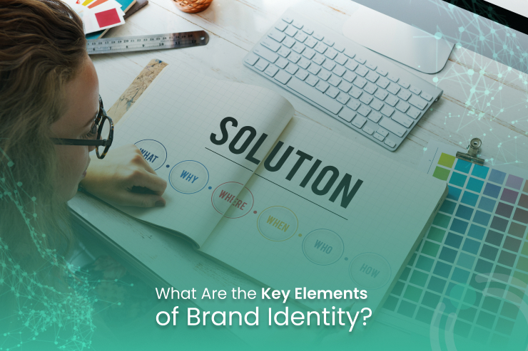
Think about the iconic green siren of Starbucks. It’s quickly recognizable, right? Now imagine it in bright orange instead of green. It just feels off. That’s because brand identity isn’t just about one symbol or color; it’s the sum of many individual elements that together shape how people perceive a brand. From logo to color palette, tone to typography, every piece matters.If your brand identity is inconsistent, it becomes weak. When it’s aligned, you build recognition, trust, and connection. Below are the essential elements of a strong brand identity and what each brings to the table.
Brand Purpose
Your brand’s purpose defines why your company exists and what it stands for. It goes deeper than your product or service; it evokes emotions and meaning for your audience. For instance, The Farmer’s Dog began because its founder’s dog had digestion issues with typical pet food, and that act of care became the bedrock of the brand.When you clarify your mission, values, and vision, you anchor your identity in something meaningful and memorable.
Brand Name
The brand name is your company’s verbal identity. It recognizes you and distinguishes you from competitors. A strong name is easy to remember, easy to pronounce, and hints at what you do. Consumers link your name with experience and trust.Avoid names that trip people up or carry negative connotations in other languages. What is innocent in one culture can mislead in another.
Logo
Your logo is perhaps the most visible graphic representation of your brand. It lives everywhere, from signage and packaging to email signatures and social profiles. A timeless logo works across contexts and generations.When redesigns go wrong (for instance, when a beloved redesign alienates fans), you see how attachment to visual identity runs deep. A logo must align with your brand’s character and serve as a stable symbol of identity.
Color Scheme
Color impacts how people feel about your brand. Red might shout energy or urgency, while blue can feel calm and trustworthy. Choose a palette that conveys the right emotional tone.Your colors should be applied consistently across all brand touchpoints, from websites to social posts to packaging. Also, keep accessibility in mind: contrast and readability matter for users with vision challenges.
Typography
Fonts aren’t just design choices; they speak your brand’s voice. Serif fonts may feel traditional, sans-serif fonts look modern, and script fonts bring elegance. But it’s more than style; it’s hierarchy, readability, and consistency.Choose your primary and secondary fonts and apply them systematically so your text communicates the brand’s tone and identity without confusion.
Graphics & Imagery
First impressions matter. Studies show people judge a website’s visual design in about 50 milliseconds. Visual assets, photos, filters, and illustrations shape how trustworthy or professional your brand appears.Define a consistent look across imagery (for instance, the same photo filters or compositional style) so your visuals form a cohesive identity.
Shapes & Iconography
Shapes and icons might seem minor, but they engage subconsciously. Round shapes tend to feel friendly, squares reliable, and triangles excited. Brand icon sets, micro-graphics, and even custom shapes add signature identity.Ensure icon styles remain consistent across applications so every detail reinforces your brand’s underlying personality.
Brand Voice
Your brand voice is how the brand speaks to its audience, whether via social posts, blog articles, or ad copy. Define a voice in descriptive words (e.g., playful, authoritative, warm) and stay consistent.Flex your style to the channel (more casual on social, more formal in business communications) but never lose the core tone that defines you.
Tagline / Slogan / Catchphrase
A memorable tagline or catchphrase sticks in people’s minds. From “Just Do It” to “Because you’re worth it,” the right phrase condenses your brand promise into a few words.Not every business requires one, but when well-crafted, it improves memorability and supports your identity.
Brand Guidelines & Application
All these elements must work collectively under a shared framework: your brand guidelines. A style guide spells out logo usage, colors, fonts, tone, imagery rules, and dos and don’ts.
Without this documentation, identities drift. Teams develop inconsistent assets, voices vary, and the brand loses coherence. A guide keeps everything aligned.
Pulling It All Together
Each of these elements contributes to a unified brand identity. They don’t work in isolation. A logo without its colors or a voice without visuals and a name without purpose all feel weaker. When they are developed together and applied consistently, your audience recognizes and trusts the brand.A strong identity sets you apart, builds recognition, and makes your brand memorable.
Partnering with OSITS for Stronger Branding
At OSITS, we specialize in crafting brand identities that resonate. Whether you’re launching a brand from scratch or refreshing an existing one, our team offers comprehensive support. We help define your brand purpose, craft your name and tagline if needed, design your logo and visual assets, develop your color and typography system, create iconography and imagery style, set your brand voice, and assemble user-friendly guidelines that your team can apply across all channels. With OSITS, your brand identity becomes a strategic asset, not just a look but a consistent experience.

Let Us Amplify Your Content Across Top Networks
Related posts

OSITS • January 16, 2026
Paid Social Strategies Proven to Work

Amna Shahid • January 16, 2026
Marketing Agency Cost: How Much Does It Cost To Market Your Business

OSITS • January 14, 2026
Organic Social Vs. Paid Social Media: Which Do You Need

Amna Shahid • January 14, 2026


